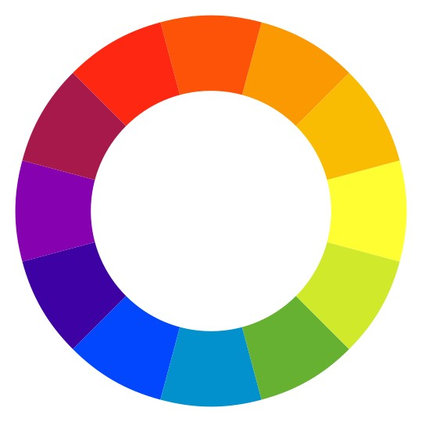
A quick brush-up on the color wheel before we start:Primary colors: Yellow, red and blue
Secondary colors: Green, orange and purple
Analogous: Colors that are neighbors on the spectrum, such as green and yellow, or red and purple
Complementary: Colors that oppose each other on the spectrum, such as green and red, or yellow and purple
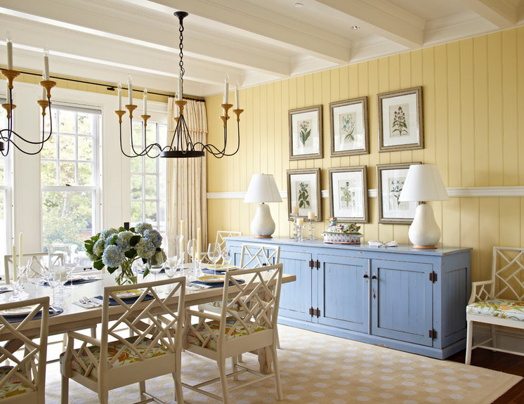
Primary ColorsYellow walls with blue accent.
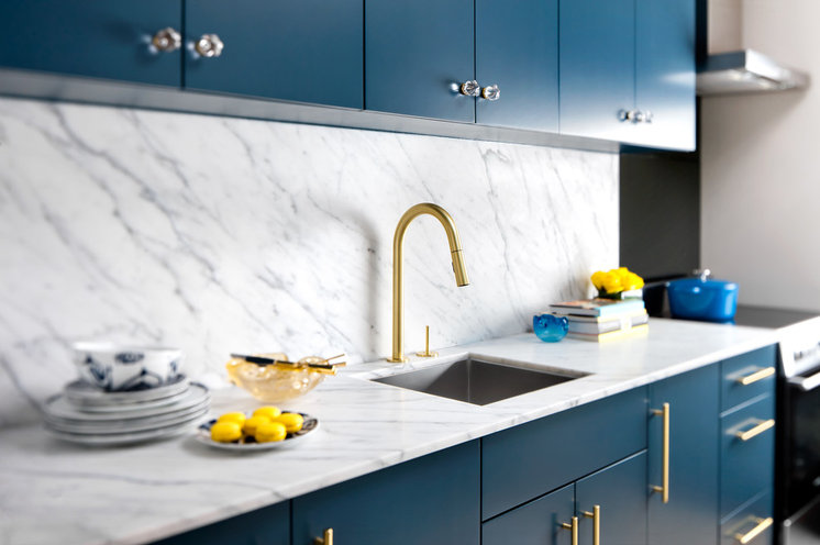
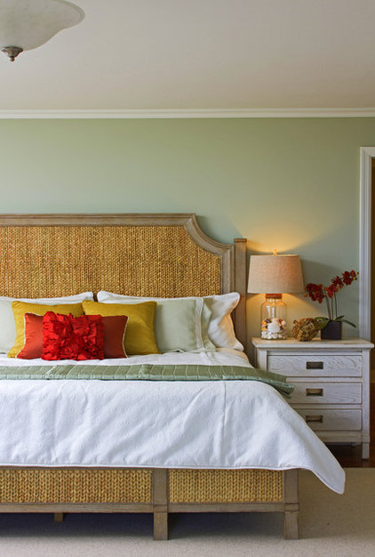
Yellow is scientifically the lightest and brightest of the hues (and naturally warm). The most classic pairing is a cool blue accent — blue being the least aggressive color choice possible. Whether you pick muted pastel shades or pair a saturated lemon with deep navy, mixing a warm yellow with a darker, chillier blue creates balance to keep the space from visually getting too hot or too loud.
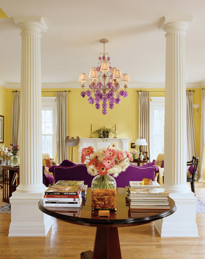
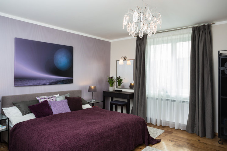
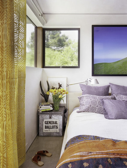
Yellow walls with purple accent. For an edgier appeal, a complementary scheme (using colors on opposite sides of the color wheel) will produce a high-fashion, high-drama look. Just check out how the purples pop against the soft yellow walls in this photo.I recommend choosing a pale yellow or using both colors sparingly, and breaking up the look with plenty of neutrals to keep the scheme from looking too jarring. The result will be the essence of spring.
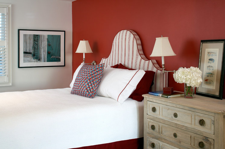
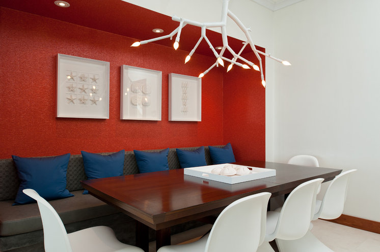
Red walls with white accents. Red almost has a life of its own outside the color wheel. It’s so intense, and associated with such symbolic meaning (love, romance, fire, appetite), that it can be the hardest to pair with an accent. Thus, one of the most popular choices is to pair red with fresh white to avoid any clashing.Even when red is applied to just one feature wall, it will feel like the strongest color in the space, so if you aren’t sure, consider it the dominant hue and not an accent.
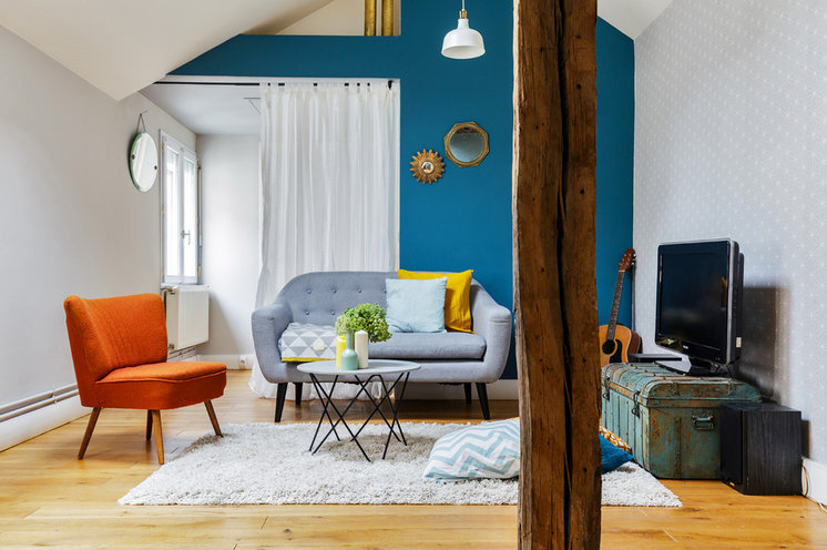
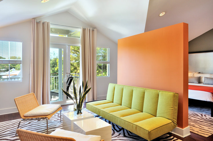
Orange walls with green accent. Orange, as a combination of yellow and red, is one of the most controversial colors — it mixes red’s heat with yellow’s brightness for a result that cannot be ignored.Blue is orange’s direct complement. If you prefer to tone down orange a little, use a leafy green; it will add a touch of coolness without fighting to be the star of the show. Choose a yellow-green for an almost analogous effect that can feel positively uncontroversial.
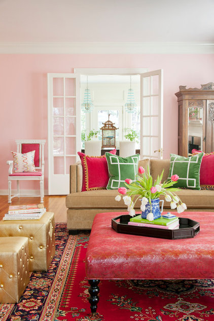
Complementary ColorsLike pink and green, the fail-safe secret to creating a complementary scheme (that your guests will indeed compliment) is to let the primary hue dominate, in a toned-down shade, while sprinkling in a light helping of the accent hue, preferably in small doses and patterns. This will ensure that the look is lively but not loony, with just the right amount of edge.
