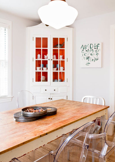
“Usually, built-ins are painted white or stained natural. However, here are some really interesting uses of color to really bring attention to your built-in.”
Denise Buck & Johnson – DC Metro Realty Team
Adding color is one of the fastest and easiest ways to stamp our personality on a room. We usually do this through the choice of wall color, followed by color on furniture, drapes, rugs and finally accessories. Seen far less often is color on built-ins and cabinetry, a more daring surface for a hue besides white since these are among the more expensive elements to install in a home. As a result, we tend to play it safe here. But the following examples convincingly suggest that white isn’t the only option to consider.
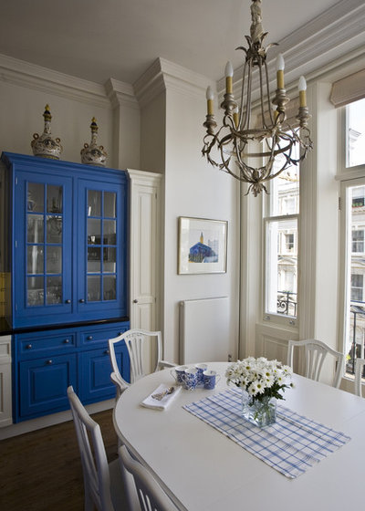
The decision to add color, and in particular a bold shade, strikes fear in many. But the payoff can be a space brimming with personality that’s unique to you and your home. The key is to apply color selectively. Rather than painting everything in sight, strategically cover a contained area, such as this built-in hutch painted a brilliant blue. Most of the cabinetry remains white, allowing the hutch to become a balanced focal point. Adding accessories and art in a similar blue is a smart move that helps integrate the hutch into the design.
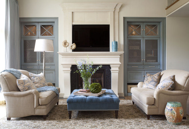
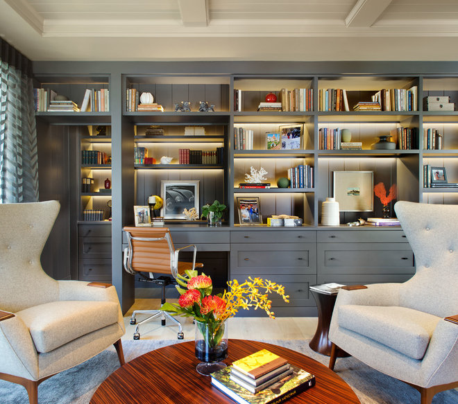
But don’t worry, the color doesn’t have to be quite that bold to have a big impact, as illustrated by the muted blue-gray built-ins flanking the fireplace in this living room. An upholstered ottoman and accessories continuing the color theme complete the design.
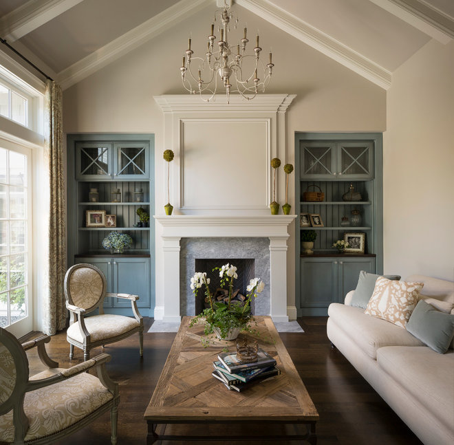
In a strikingly similar living room, nearly identical dusty-blue built-ins add significant character, with the blue tones repeated on the fireplace surround and pillows for an elegant look.
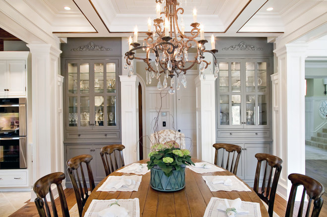
Painting built-ins with a distinct color seems somehow less daring when they’re surrounded by white millwork. And when the cabinetry to be painted comes as a pair, this classic symmetry gives license to introduce color without visually upsetting the cart.
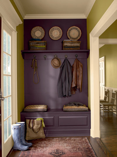
In other instances, it pays to just go all out. The purple covering an entry built-in is happily vibrant mixed with green walls and white trim.
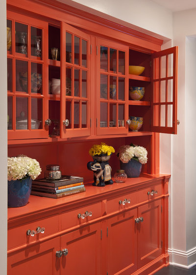
Bright orange is taking bold color to the extreme, but it’s absolutely wonderful here. Lucy Penfield ofLucy Interior Design shares the specifics. “This was a fabulous old pine cupboard original to the house. We repurposed it with a splash of coral enamel and relocated it from the kitchen to the lower level to use as a bar.”
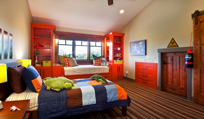
If bringing bold color into the living areas continues to put fear in your heart, how about trying it out on built-ins in a child’s bedroom or bonus room? The use of color is generally more expected in these spaces, which are also typically self-contained rooms not visible from the main areas of the home.
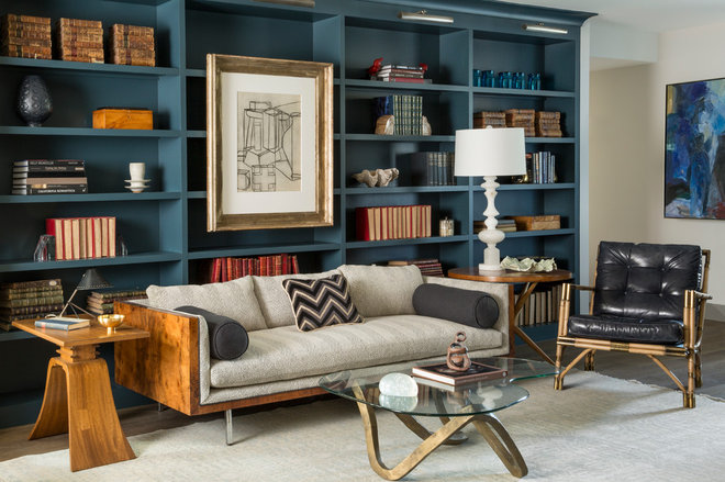
Bookshelves are a wonderful item to consider painting since they provide the option to break up the expanse of color not only with books and decorative items on the shelves, but also with artwork. The gorgeous blue here is Pratt & Lambert’s New Moon in a satin finish.
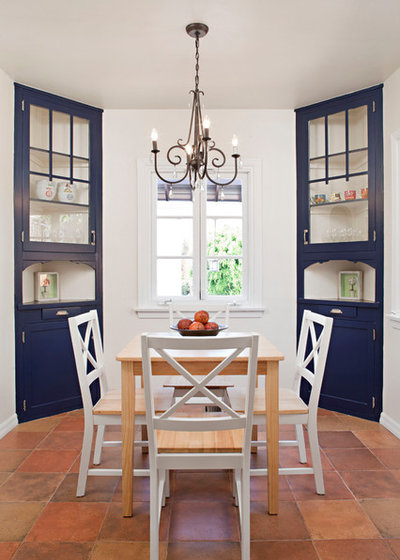
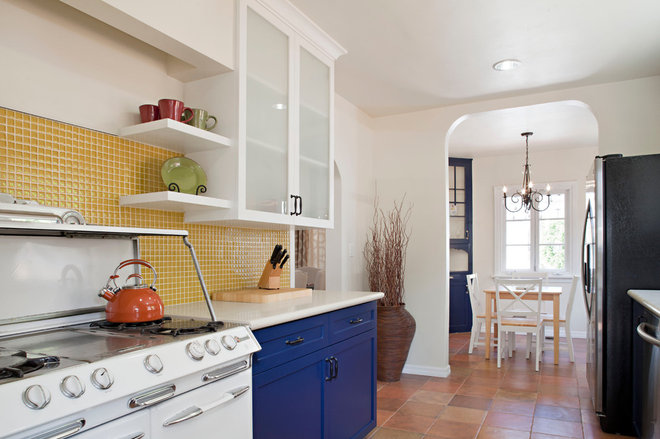
To ensure that built-ins boasting color visually make sense with the adjacent areas, one tactic is to extend the color from one space to another. In this example, the navy blue on a pair of corner hutches in a dining nook shows up on lower cabinets in the adjoining kitchen.
While the lower cabinets are navy, the upper cabinets, walls and appliances remain white to keep things light and fresh.
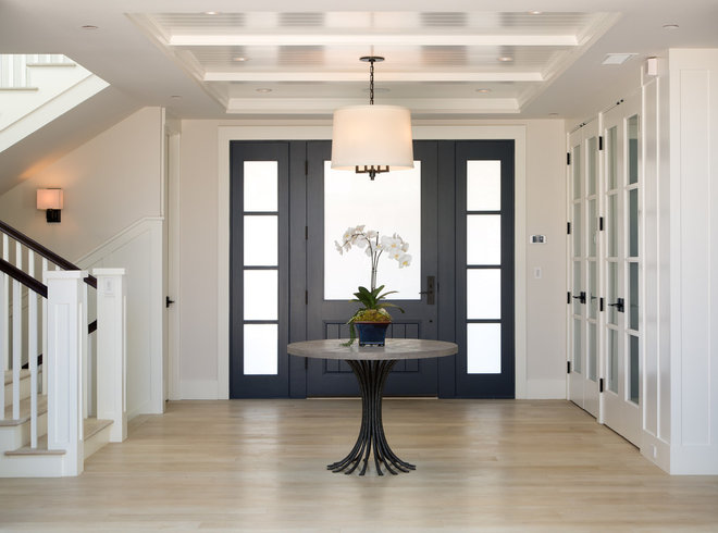
In another example of extending color from one room to another, the gray-blue on these built-ins repeats in the entry on the front door and sidelights.
The color looks a shade darker here, and it certainly could be, or it may simply be due to lighting differences. Carrying accents of color from one room to another is an effective way to bring visual harmony throughout a home.
OK, so you love the idea of painting built-ins with a rich color but are thinking, “Why stop there?” Good for you! Yet another approach is to continue the color from the cabinetry on the surrounding walls.
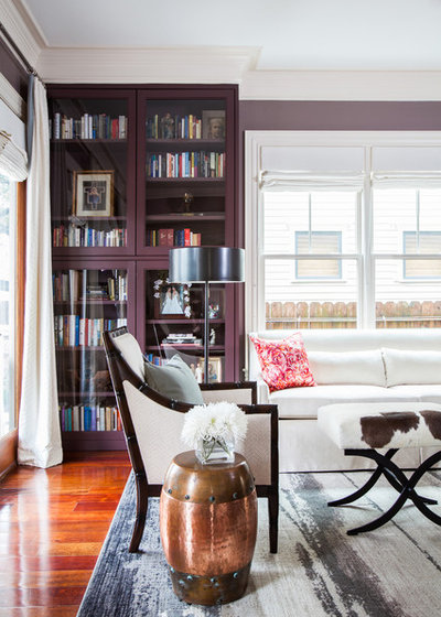
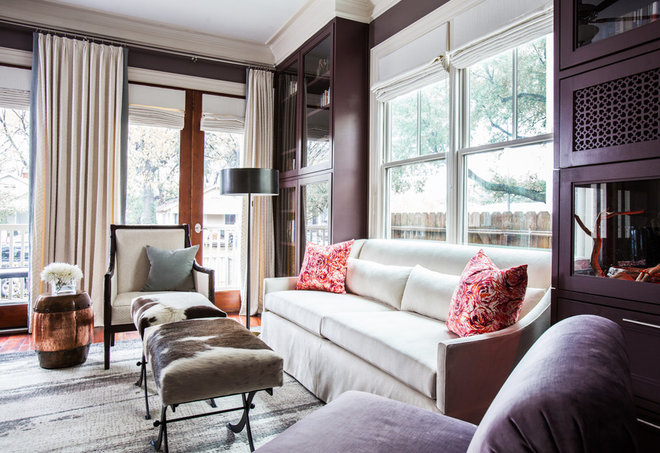
Here, a deep shade of eggplant covers the bookcases and walls — particularly effective since both the cabinetry and wall sheen are the same. The color’s volume is balanced by ample white trim, white window coverings and furniture, and the bright light filling the room.
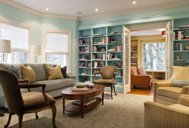
And if one color is good, add a second complementary hue in an adjoining room. In this home, a light turquoise, Benjamin Moore’s Spectra Blue, covers the shelves and walls in the living room, while the library next door benefits from the same treatment in a different color.
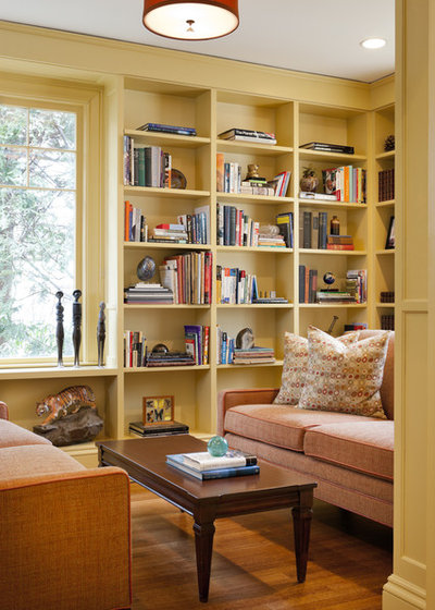
The beautiful pale yellow, Benjamin Moore’s Golden Tan, covers built-ins and walls for a cozy reading environment.
Is all this color a bit too much, but you’re intrigued nevertheless? As an alternative, start with a small surface to cover. A good spot to test your color tolerance could be the back wall of open cabinetry, or perhaps the back of cabinetry and built-in hutches featuring glass doors where a peek of the color will show through. Just pick up a small can of your favorite paint color and give it a try.
Originally published by Janell Beals, HOUZZ
