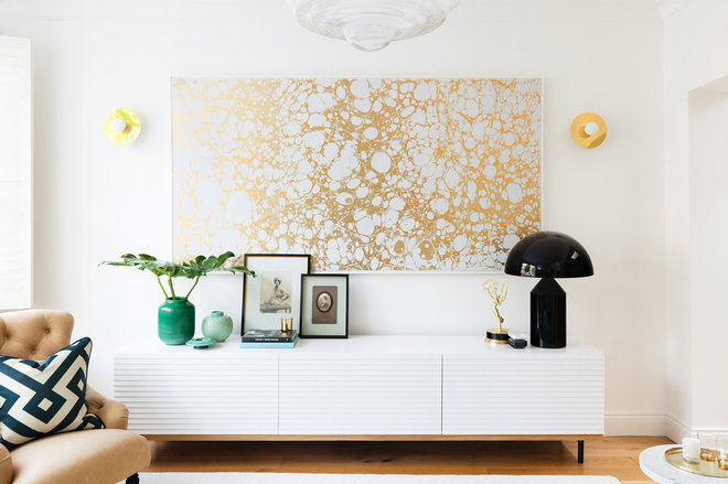
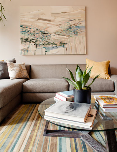
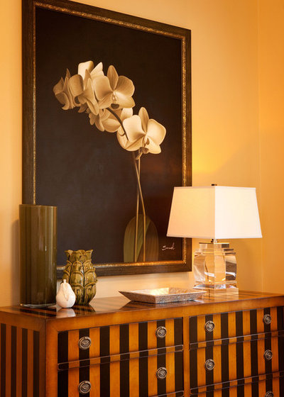
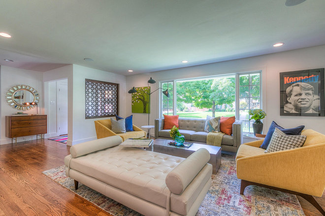
Does it work with the space or overpower it? This can depend on the subject matter or colors and how they relate to the furnishings. The gold-and-white art pictured above the console fills the expanse perfectly, doesn’t compete with the room and doesn’t overwhelm the smaller objects in front.
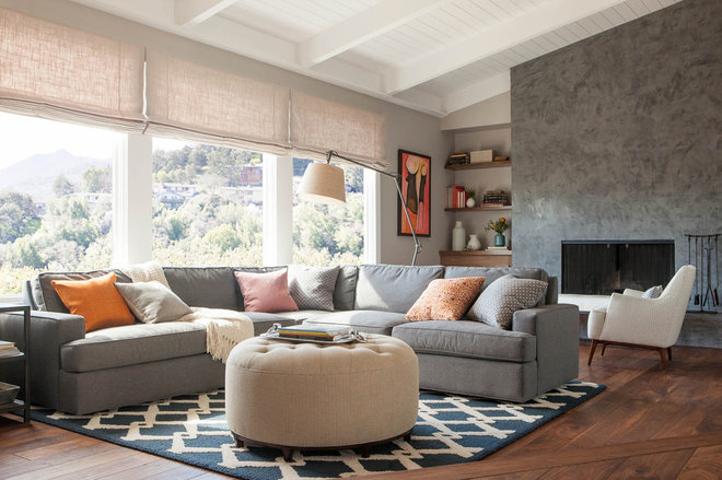
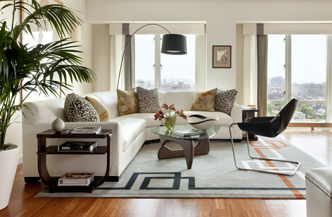
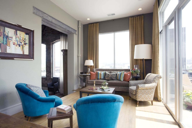
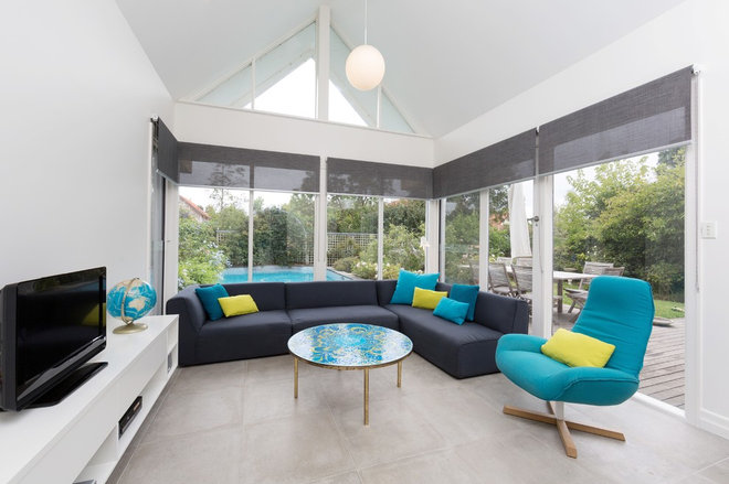
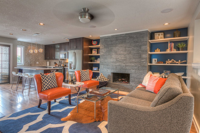
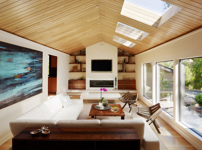
A sectional can be used in a diminutive space, but to scale it properly, you should ensure that it doesn’t take up the whole room, obscure the bottom half of windows, bump up against the fireplace or overflow into other spaces. Accompanying pieces should be more visually spare —think open legs, glass tops, thinner frames — to keep the space feeling more expansive.
In an entry, you may want to add a little ambience, so a visually clean lamp with a small base, like the crystal lamp shown here, is the perfect scale. The powerful vignette created by the large art, little but luxurious lamp and wide console is a great example of varying the scale of different pieces for an attractive arrangement.
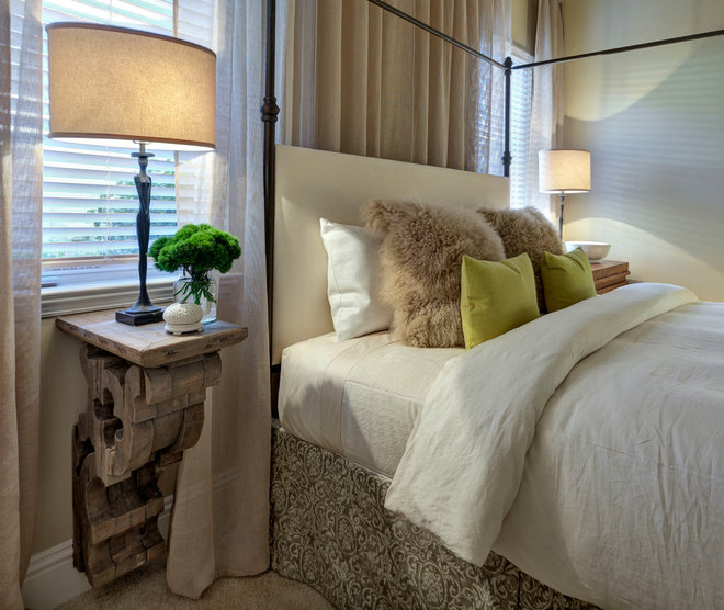
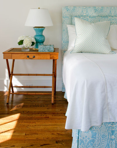
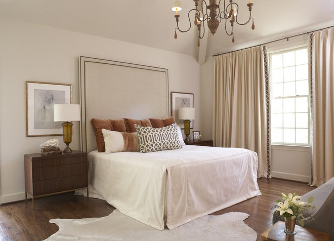
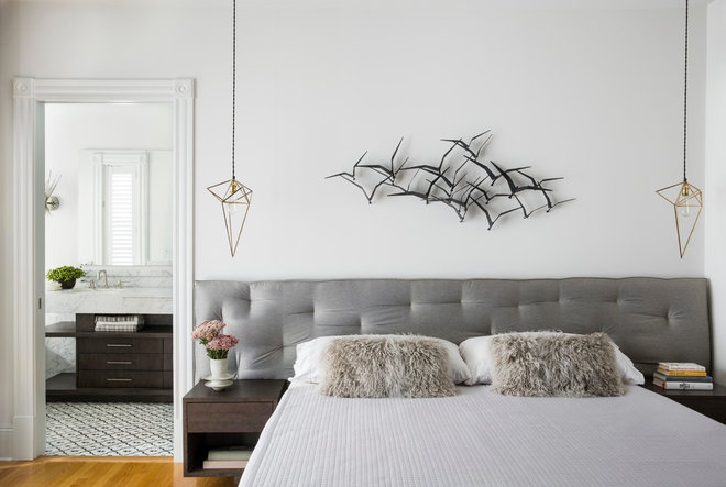
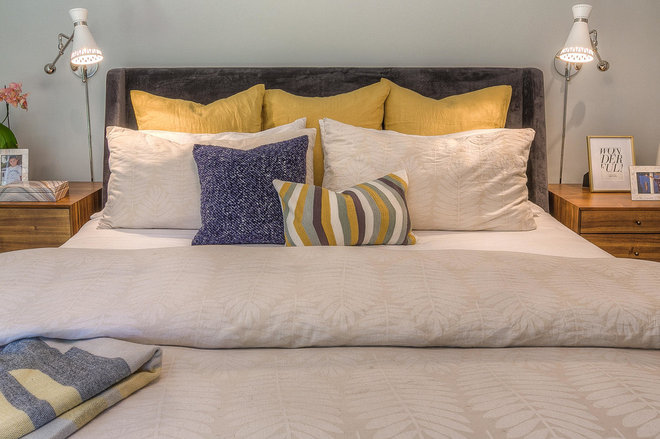
Good to know: Add visual impact to even the most understated headboard by using special fabric and adding luxurious details like nailhead trim, tufting, borders or contrasting piping.
