“Have you ever struggled to determine if something was too big, or too little to fit appropriately in a space? Well here are some tips on how to figure it all out.”
Denise Buck & Ed Johnson – DC Metro Realty Team
Having a firm grasp on scale is one of the most important aspects of designing a room that looks and feels right. Scale is the visual representation of size and how objects interact with one another in any given space. For example, the size of a chair relative to the lamp and table beside it can make or break the composition of the pieces. Knowing how to layer in items of varying widths, heights and weights is less about science and design rules, and more about instinct and an understanding of aesthetics. Here are five tips for getting a grip on scale and creating visual harmony in your home.
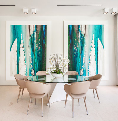
1. Remember that bigger is better with large or long walls. A common decorating dilemma is the large or long wall. A big blank expanse can fool you into thinking that you need a hundred pieces of art to make it work. Although creating a gallery wall may seem like an obvious solution, it isn’t always the best one. Depending on the style of the furnishings, the proportion of the room and the amount of visual space you want occupied, a single statement piece can solve a multitude of challenges.
When it comes to large art, consider the following:
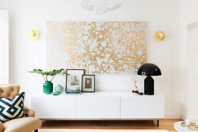
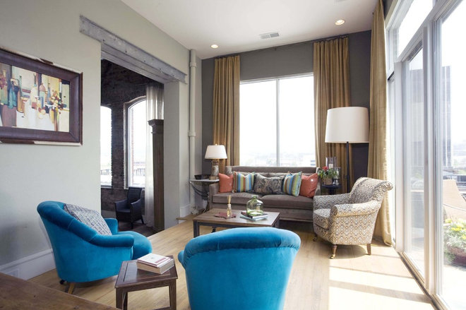
Does it work with the space or overpower it? This can depend on the subject matter or colors and how they relate to the furnishings. The gold-and-white art pictured above the console fills the expanse perfectly, doesn’t compete with the room and doesn’t overwhelm the smaller objects in front.
Does the art fit without seeming crowded? A large piece (or pieces) should hang on the wall while leaving plenty of negative, or empty, space around it. Height is just as important as width when it comes to scale. Higher ceilings call for taller pieces that anchor the space and the objects around it. A lower, longer wall can support a triptych or a single horizontal piece.
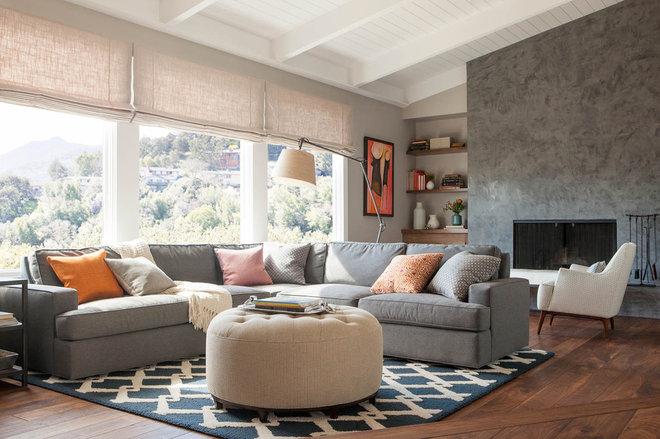
2. Select seating for the size of your space. Just because your space is small doesn’t mean your furniture has to be, with the exception of the sectional sofa. Determining the right sectional for your room depends on the room size as well as complementary pieces (lamps, side tables) you want to add and whether they’ll all fit comfortably together.
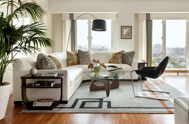
A sectional can be used in a diminutive space, but to scale it properly, you should ensure that it doesn’t take up the whole room, obscure the bottom half of windows, bump up against the fireplace or overflow into other spaces. Accompanying pieces should be more visually spare —think open legs, glass tops, thinner frames — to keep the space feeling more expansive.
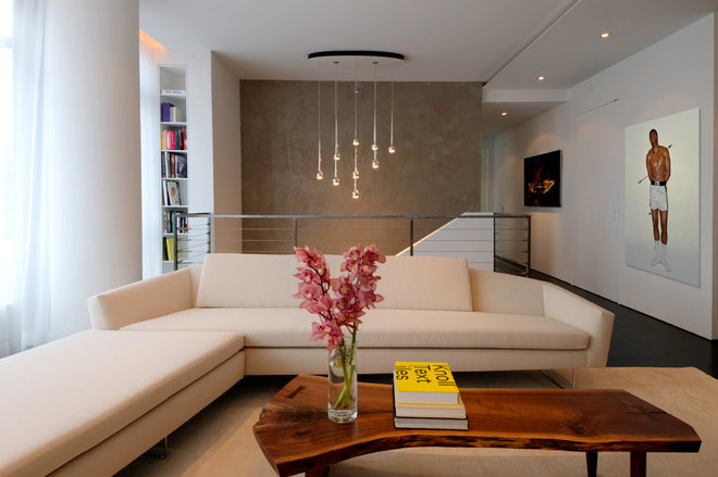
When choosing your seating, consider how you use your space. Most guests won’t mind sitting together on a sofa, but it’s always good to have chairs, a bench or a large ottoman as an alternative. When you have a sectional or large sofa, visually and physically pared-down accent chairs work well because the scale of the sofa makes it the most powerful piece in the room.
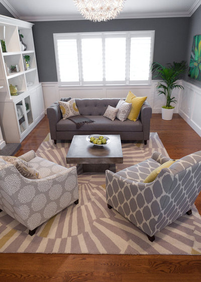
If your sofa is more petite (say, love seat size), you can — and should if you have the room — up the scale of your accent seating by going for pieces with broader arms, taller backs or more width. In this kind of an arrangement, all pieces are on a level playing field and should stand up to one another visually.
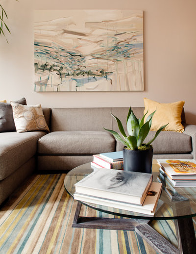
3. Think of your coffee table as a puzzle piece. Imagine how all the pieces are going to fit together in the room. This is especially helpful when choosing a coffee table. Visual scale is a key element in finding the one for your needs. If your seating takes up a great deal of space, look for coffee tables that are visually less weighty, such as ones that are glass, open underneath or in an unexpected shape like round, soft triangular or oval.
Your coffee table should fulfill its function as a place to set a drink, stack books or display beautiful items. Ideally, it shouldn’t be more than an inch lower than the seats of your sofa and chairs to allow for ease of use. It should also cover enough floor space to allow for everyone sitting on the sofa to reach it. You’ll need drink tables for optional seating that’s located farther away.
4. Choose a lamp sized to complement its surroundings.Picking the right-size lamp can be mystifying. There are many types, and each serves a different purpose: task lamps, table lamps, floor lamps, desk lamps. So first and foremost, look for the lamp best suited to your situation.
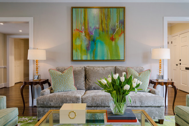
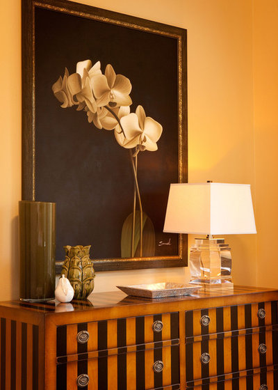
In an entry, you may want to add a little ambience, so a visually clean lamp with a small base, like the crystal lamp shown here, is the perfect scale. The powerful vignette created by the large art, little but luxurious lamp and wide console is a great example of varying the scale of different pieces for an attractive arrangement.
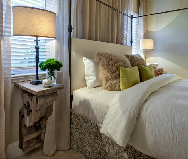
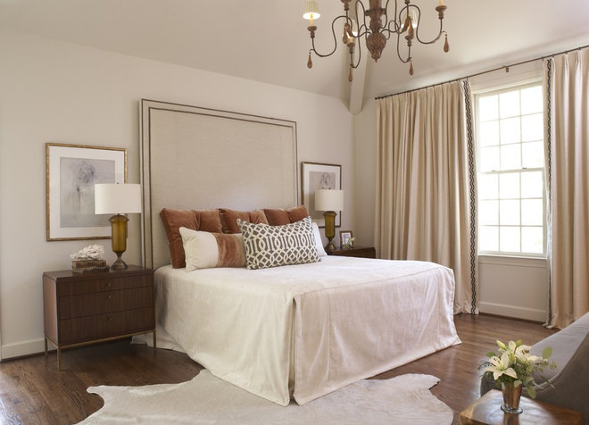
Lamps add height and balance to the overall look of your bed and night tables. They should provide the amount of light you need to either read in bed or gently illuminate the space. Ideally, you shouldn’t be able to see up under the shade when reclined in bed, and the base shouldn’t take up most of the tabletop. Although the corbel used as a nightstand in this photo has a small top, the bedside lamp is long and thin with a simple shade. It’s scaled perfectly for the classic and elegant style of the room.
Also, you don’t need to have two identical lamps on either side of anything. You can have any sort of lamps you like as long as you scale them properly to work with the furnishings surrounding them. A smaller table lamp to add warmth paired with a tall floor lamp to add uplighting and overall brightness works when the shades are kept simple and similar in form. Having two tall floor lamps or two small table lamps isn’t wrong, but neither combo works as well against a rich accent wall like the one pictured.
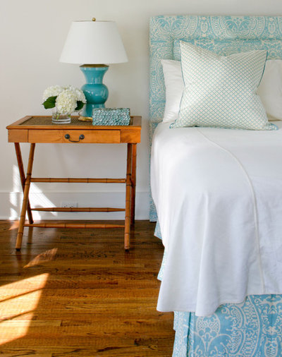
5. Let the headboard help frame the bed. Think of a headboard as the finishing touch for your bed. Without one, the blank wall behind your pillows looks sort of, well, unfinished. Whether you go for upholstered, metal, wood or woven, it’s important to consider your ceiling height, your wall space and what look you are going for — dramatic, refined, feminine or modern.
Good to know: Add visual impact to even the most understated headboard by using special fabric and adding luxurious details like nailhead trim, tufting, borders or contrasting piping.
An oversize headboard installed in a room with a ceiling higher than the U.S. average (8 feet) adds balance by creating a feeling of grandeur. Putting a king-size bed in a room with tall ceilings would still make the bed seem smaller than it is. Adding an oversize headboard gives a bed presence.
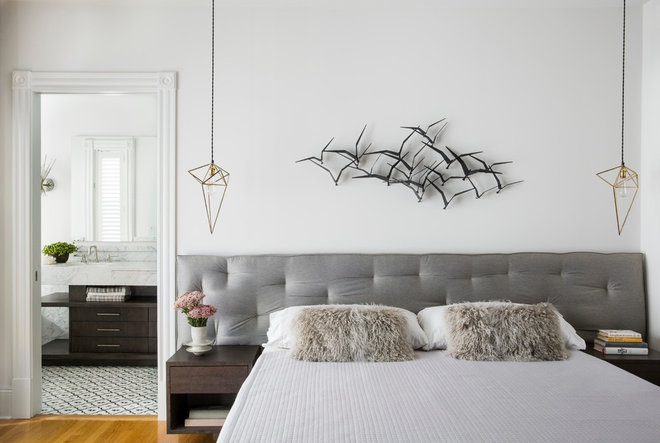
You may not have a lot of wall space, but that doesn’t mean you can’t have a headboard. To add the illusion of width to a wall, consider something long, low and upholstered, rather than something traditional. Add a piece of art, keep the bedside tables on the small side and pair them with wall-mounted sconces or unexpected pendant lights. You’ll have a beautifully dressed room you’ll never want to leave.
Originally appearing on HOUZZ, by Melisa LaBlancz-Bleasdale
