“Over the years we’ve probably all learned a few lessons the hard way. Hopefully, we were able to move on from them and not repeat them. Here are some that we particularly like.”
Denise Buck & Ed Johnson – DC Metro Realty Team
“Over the years we’ve probably all learned a few lessons the hard way. Hopefully, we were able to move on from them and not repeat them. Here are some that we particularly like.”
Denise Buck & Ed Johnson – DC Metro Realty Team
“Want to be ready for when your guests arrive for the holidays? It only takes a little extra effort to show you care.”
Denise Buck & Ed Johnson – DC Metro Realty Team
Is your home ready for holiday visits from friends and family? Here’s how to prepare for the invasion. Read
Visit houselogic.com for more articles like this.
Copyright 2016 NATIONAL ASSOCIATION OF REALTORS®
“Where to put the litter box? It’s tough decision to make since you don’t want it too open, but the cat has to actually get to it. Here are some interesting ideas that approach things a little differently.”
Denise Buck & Ed Johnson – DC Metro Realty Team
“Mirrors are a great way to give a small space larger feel. They can also serve as a great expression of how you feel about a room, or set the tone as you enter room.” Take a look at these and get inspired!”
Denise Buck & Ed Johnson – DC Metro Realty Team
“Is your house ready for Trick or Treaters? You can make your home spooky, but don’t forget they still need to be able to make it to the door without a lot a trouble.”
Denise Buck & Ed Johnson – DC Metro Realty Team
Add safe and festive lighting. A few lanterns along the path put light right at trick-or-treaters’ feet. Battery-operated lights offer illumination without the hazards that come with an open flame, says Judy Comoletti, division manager for public education at the National Fire Protection Association. If you use a real candle, she says, a trick-or-treater’s costume could drape onto it and catch on fire. “If you absolutely need to use a real candle, you have to be more vigilant,” she says.
Homeowners who choose to have open flames need to watch them at all times, keep them 1 foot away from anything that can burn, and sit them on a sturdy, level surface.
2. Trim dead tree limbs. Dead limbs are more likely to fall during winter storms, making them a potential safety hazard. Have an arborist inspect and trim large trees.
3. If you haven’t already, clean gutters and downspouts. Wait until most of the leaves have fallen to schedule a rain gutter cleaning. Inspect gutters and downspouts for cracks and loose parts and make repairs as needed.
Bring in cut branches from your yard, stop by a pick-your-own farm or scoop up fall’s bounty at a farm stand.

Photo by: Shutterstock
Life is a lot less hectic when you find ways to keep your home organized, simplify storage and find DIY solutions that are affordable and easy. Here are some of our favorite clutch tips for your home.

via The Sweetest Occasion
Add personality to every meal with customized dishware that you can make yourself in minutes. You don’t need to be an artist or have special art supplies. Just grab a Sharpie® and draw your design freehand (or use a stencil for more intricate patterns) on your dishware or mug. Clean, white enamelware works well. You can personalize your creation with a name, signature monogram or even a favorite quote. To make it permanent, bake your finished design at 350 degrees for 30 minutes. Tip: Start with a cold oven to allow the dishware to gradually come up to temperature. Also, hand washing will help your artwork last.

via Storage Talk
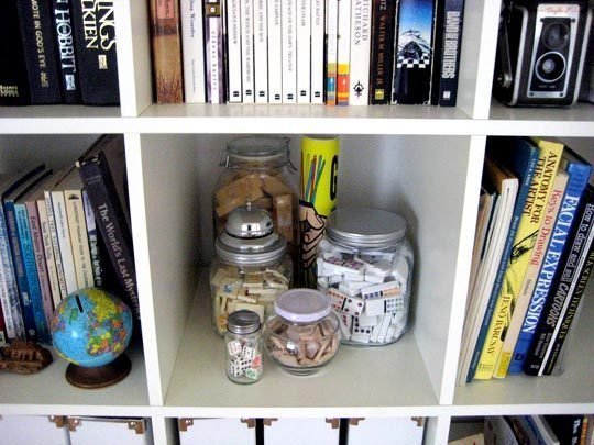
Family rooms often have to do double duty as a playroom and entertainment hub. But finding room to store all your playthings without compromising your sophisticated style can be challenging. This hack meets that challenge head on: Simply store your puzzles, dice and other game pieces in decorative jars. They’re even fun to look at and provide a unique storage solution so you don’t have to make room for bulky game or puzzle boxes. Choose jars in different sizes, shapes and colors to add visual interest and to match your decor. Mason jars, apothecary jars, etched glass jars or pressed glass jars are all great options.

via Buzzfeed
Seems you can never have enough storage, especially in the bedroom. This hack lets you add storage and a decorative wall detail at the same time. Just create instant shelves from old drawers. Vary shapes and sizes for an eclectic look. Line the bottom of the drawers with patterned paper or paint for added color. Look for dressers with unusual curved drawer fronts or undulating profiles. Tip: You can often find reasonably priced dressers/drawers at garage sales, resale shops, vintage stores or estate sales.

via Make Space
It can be frustrating fighting to find your favorite jeans in a cluttered closet. If you’re not ready to slim down your wardrobe, have no fear. This hack lets you retain all your perfectly worn-in pairs, but in a more organized manner: Hang your jeans on shower hooks. Saves a ton of closet space and makes finding your favorite pair a snap!

via Buzzfeed
Sure bathroom hooks are essential for hanging wet towels or robes, but no one says you have to use standard hooks that are purely functional without any decorative appeal. Instead, use old doorknobs as hooks. This super simple hack adds a ton of character to your bathroom while it maximizes wall space. Tip: For a cool shabby-chic vibe, use a grouping of vintage doorknobs that have finishes with a little wear and tear.

via Green Idea Reviews
Bet you didn’t know that you could easily conquer dryer static with just some ingenuity and aluminum foil. It’s true! It turns out balled-up aluminum foil can minimize dryer static. Here’s how: When you’re ready to dry your washed laundry, just throw three aluminum foil balls (about 3 inches in diameter each) in your dryer and tumble dry your load as normal. These anti-static wonders are easy to make, economical, reusable for up to 6 months, recyclable and help you avoid toxic chemicals found in dryer sheets. Tip: Heavy-duty foil works best. Wrap a tennis ball in foil. This will help you use even less foil to make a sizable ball and the tumbling tennis ball helps fluff your laundry as it dries.
 via Mashable
Smartphone accessories, like a phone stand, can be kind of pricey…unless, of course, you know how to make it yourself with inexpensive office supplies. This hack makes good use of binder clips, which you probably already have at home. When positioned in just that right way, your binder clips can make a quick and functional phone stand. When you’re done using your ingenious phone stand, just slip the clips back in your desk drawer. Job well done!

via House Logic
Rusty tools are the bane of any true handyman or handywoman. Here’s a great way to make sure you won’t have to worry about that: Use blackboard chalk to prevent your tools from rusting. Just place several pieces in your toolbox. The chalk traps dampness, which helps keep your tools rust-free, giving you one fewer excuse to not be handy around the house.

via Childhood 101
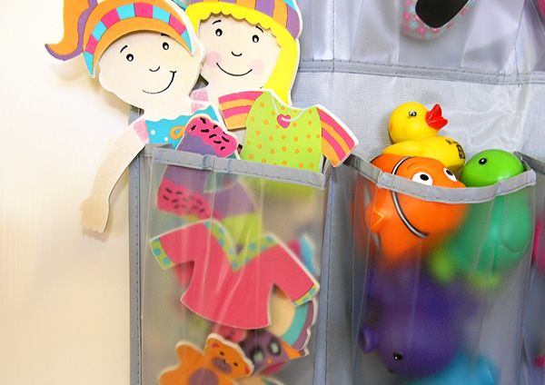
Playrooms can be a messy prospect, but they don’t have to be with this awesome household hack. Just use an over-the-door shoe organizer for toys or art supplies. The clear compartments make for easy access and easy clean up. So simple, it’s like child’s play.

via Olives ‘n’ Wine
Chances are if you’re hosting and elegant party in your dining room, you’ll want to break out the good china and silver. That means making sure your silver sparkles and shines. Here’s how with just some baking soda and hot water. Line a pot or your kitchen sink with foil. Fill it with very hot water and mix in about 1 cup of baking soda. Add your tarnished items and let soak for about 30 minutes or until you see the black residue lifting off the surface. Then just rinse and dry (or first clean with a mild dish detergent) to use right away! Et voilà, dinner is served!
Designer: Nicole Guthreau and Stephanie Tamayo of Dalliance Design
Location: Summit, New Jersey
Size: 272 square feet (25.2 square meters); 16 by 17 feet (4.8 by 5.1 meters)
Homeowners’ request: Bump out a bay window for more space and add bigger, transitional windows. Replace dated furniture and add new finishes. ”Our client really wanted the space to be one-third transitional, one-third midcentury and one-third Hamptons, so to do this we needed to take an eclectic approach,” designer Nicole Guthreau says.
Fun factor: Large (60-inch-diameter) capiz chandelier from a Brussels hotel.
Other special features: Dramatic dark blue-gray ceiling pops against neutral walls. Vintage 1940s dining table. Hardwood floors in half Jacobean and half classic gray stain. Regal tufted wing chairs in denim-like blue woven fabric for the host seats. Lucite drapery hardware.
Designer secret: “Painting the ceiling a darker hue is a simple trick anyone can use to add depth to their space,” Guthreau says.
“Uh-oh” moment: “When the chandelier came in from overseas, we realized that it only had one bulb,” Guthreau says. “We assumed there were going to be additional recessed lights added to the ceiling, but alas the architect probably thought that we would add a fixture with more light output. Cut to the paint already being done and we couldn’t get back in the walls. Luckily, the space gets ample amounts of natural light, and with the addition of some lamps we were back in business again.”
Also on the team: Custom Creations (cabinetmaker); R. Keller Construction Co.; Rosen Group (architect); Andrew Frasz (photographer)
Dining table: The Harp Gallery; host chairs: Jessica Charles; side chairs: Baker Furniture; rug: Restoration Hardware; drapery fabric: Waterpolo Cloud, Kravet; drapery hardware: Lux Holdups; lamps: Visual Comfort; decanters: Joe Cariati; artwork: Julia Contacessi; chandelier: 1stdibs; buffet: Custom Creations
Designer: Leigh Jones of The Very Thing
Location: Burlington, North Carolina
Size: 156 square feet (14.4 square meters); 12 by 13 feet (3.6 by 3.9 meters)
Homeowners’ request: Replace old grass cloth with wallpaper that would work with the existing window treatment and rug.
Fun factor: Large-print wallpaper.
Other special features: Antique walnut drop-leaf dining table, made by Hinkle-Harris.
Why the design works: “Wallpaper often works to balance spaces that are not symmetrical or have no architectural interest,” designer Leigh Jones says. In this case, where the dining room is open to the living room, the wallpaper consolidates both spaces.
Designer secret: “The rugs in both spaces are nearly identical, which creates a flow between the spaces,” Jones says.
Also on the team:Smith Cameron Photography; Mary Beth (stylist)
Wallpaper (discontinued): Designers Guild; valance: Scalamandré; rug: Rosecore; chair fabric: Nina Campbell; lamps: Bradburn; furniture: antiques
See more of this home
Designer: Julie Dunfee
Location: Wheaton, Illinois
Size: 336 square feet (31.2 square meters); 21 by 16 feet (6.4 by 4.8 meters)
Homeowners’ request: A clean, contemporary feel with a lot of color and warmth.
Fun factor: Square, lightly distressed table that can seat eight people.
Other special features: Fireplace focal point wrapped in quartzite stone. Colorful dining chairs.
Designer secret: “I love to add a bit of height to any room I design by placing the drapery to the ceiling, and hide the hardware so the drapery can really shine and become its own work of art,” designer Julie Dunfee says.
“Uh-oh” moment: “At one point in the build of the kitchen, the island was made bigger than the original plan, thus making the space where the table was to go a bit smaller,” Dunfee says. “Seeing as we had already purchased the table and chairs, we had to modify the depth of the countertop on the island to make sure everything would fit.”
Also on the team: Davidson Custom Homes (builder); Tommy Nguyen of Flooring Impressions (tiler); Mike Kaskel Photography; Elegant Custom Drapery
Drapery: Kravet; table: custom, Mackenzie Dow; chairs: Designmaster Furniture; fireplace stone: Night Glitter quartzite ledgerstone, Lewis Floor & Home; light fixture: Elegant Lighting; wall paint: Shoreline, Benjamin Moore; chair fabric: Fabricut; hippo sculpture on table: Neiman Marcus
Designers: This project was a collaboration among Nancy Gracia of Bare Root Design Studio, Molly Hanisch of Sullivan Building & Design Group, Bradley Sullivan of Cider Press Woodworks and the homeowner.
Location: Doylestown, Pennsylvania
Homeowners’ request: A new home that would emulate the Colonial style of the town, with a dining area and kitchen that would appear to have been added on over time.
Fun factor: Window bench with custom cushions.
Other special features: Wood beam that helps define the space. Farm-style table and chairs.
Also on the team:Ralph C. Fey (architect); Paul S. Bartholomew (photographer)
Thomas O’Brien Reed 1-light sconces: Visual Comfort, available on Houzz; New England Stretcher Base table: J.L. Treharn; Windsor-style chairs: similar available on Houzz; rug: Restoration Hardware; 3-light aged brass chandelier: Menlo Park Collection, Hudson Valley Lighting, available on Houzz; cushions: custom; throw pillows: mix of custom, Pottery Barn and HomeGoods
Designer: Alisha Gwen
Location: Pittsburgh
Size: 180 square feet (16.7 square meters); 12 by 15 feet (3.6 by 4.5)
Homeowners’ request: Use the colors in the existing artwork as inspiration for a top-down redecorating effort.
Fun factor: Bright colors and patterns.
Other special features: Original artwork. Glass-like tabletop made by applying an aniline dye finish to the wood top. “It brought out the wood pattern in the tabletop and complemented the artwork,” designer Alisha Gwen says.
Also on the team: Fischer Renovation (construction); Erin Alvarez (photographer)
Drapery fabric: Quadrille; drapery hardware: Kravet; dining table and buffet: Century Furniture; dining chairs: Vanguard Furniture; chandelier: Arteriors
The smaller pieces sitting casually on the floor are a relaxed way to show off art. The room has an “undone” feel that’s stylish without trying too hard. Resting artwork on a floor, shelf or mantel can take away the formality of the piece and give it a modern look.
Be brave with your color choice and even pick out a hue that appears in the painting. These homeowners have added to the gallery effect by placing a wall light above the canvas.
Hunt for items of varying heights, perhaps a few with a theme, as these homeowners have done with the giraffes. Visit thrift shops and flea markets to find items that will complement your new addition, and arrange them until you’re happy with the vignette.
Here, the painting on the wall has inspired the palette of the living room. The inky walls make a dramatic backdrop, while the soft furnishings and decor items pick out the greens and yellows in it.
This is a beautiful way to enjoy random things you’ve inherited. Even an old tennis racket or theater program could be part of the display — anything goes with this one!
Another option is to cover a lampshade. Search online for kits that contain lampshade frames, panels, adhesive and finishing tools, as well as instructions that will walk you through the process.
Highlight its contrast to your decor by painting it a bright color. Rub down all the wood with fine sandpaper and cover any glass panels with masking tape around the edges and newspaper in the center. Brush on a layer of primer or undercoat and top with eggshell paint to protect the piece. You can then add the finishing color.
Once you’ve painted it, turn your attention to the details. Handles, for example, are easy to change.
To paint a similar sideboard, work from the top down and start by painting the pale blue sky area. Let this dry, then apply the lilac. Continue working down, one color at a time, until complete.
Embrace the fact that a collection is eclectic and that that’s what makes them special. They span decades and can be added to over the years.